Print / Transit Poster
TTC Subway — "Ride the Rocket"
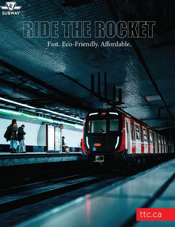
Transit campaign poster · Toronto Transit Commission
A transit campaign poster for the Toronto Transit Commission (TTC) built around the iconic "Ride the Rocket" positioning. The design leans into the cinematic drama of the subway environment — dark tunnel atmosphere, motion-lit train, commuters on the platform — to reframe public transit as something aspirational rather than merely functional.
Headline treatment
The title "RIDE THE ROCKET" uses a condensed, distressed display typeface that evokes speed, grit, and urban energy — a deliberate contrast to the polished sans-serif of the TTC's standard brand. It sits as an overlay on the image, integrated into the scene rather than floating above it.
Messaging hierarchy
The three-word subline "Fast. Eco-Friendly. Affordable." distils TTC's core value proposition into the fewest possible words — addressing the three main objections commuters have when choosing between transit and private transport.
Branding
The TTC roundel logo anchors the top-left, the ttc.ca web address is given a bold red pill treatment in the bottom-right corner — high contrast against the dark image, impossible to miss, and consistent with the TTC's red brand identity.